- Designing for Delight
- Posts
- The hot new interface is no interface at all
The hot new interface is no interface at all
How TikTok is inspiring the next generation of mobile app UI
You’re going to see more and more mobile apps embrace the infinite vertical scrolling list, inspired by TikTok and IG reels.

Image: Spotify
When industry giants like Spotify start integrating a design trend, it's a clear sign of its staying power. The vertical scroll is no longer just for social media—it's reshaping user experiences across the board.
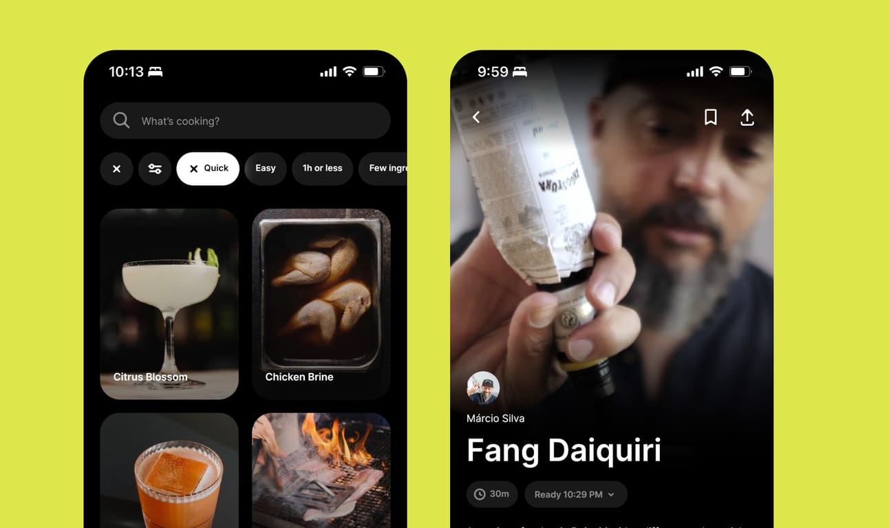
Smaller new apps like CREME are using the approach in fresh new ways. CREME is insanely great—a design and UX masterclass. When you open the app, you’re immediately immersed in an endless feed of beautiful full-screen video recipes from chefs.
There’s almost no interface. Just the content and you.
But TikTok UI influence actually goes deeper, touching every part of the app.
The interface makes generous use of the Y axis overall, filling the screen with luscious photos. Swiping through the app feels effortless and ephemeral because the team invested time in great progressive loading animations and milky smooth page transitions.
The typography is big and chunky, with generous whitespace that makes it feel breezy and accessible.

CREME on iOS
This shift towards the vertical scroll is more than just a passing phase. It's the next wave of immersive, engaging mobile experiences that will inform a new generation of apps.
That’s it for this week. Thanks for reading!
—Neil
